“Davidson” makes the case that it is indeed flawed analysis….
Robert Shiller has made quite an impact with his various appearances in the media and his active financial consulting business heavily promoting his negative market views. I downloaded his spreadsheets with the goal of understanding his views better, but was surprised to discover serious errors in his approach. I start with his analysis of the housing data and then follow with his view of the SP500.
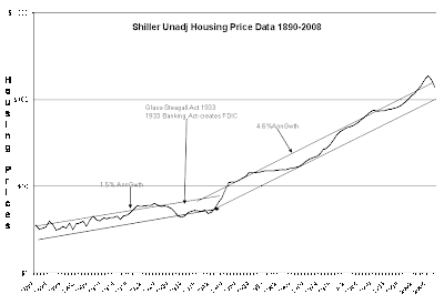
This is an analysis of Robert Shiller’s data downloaded from his site with out modification. His chart is inflation adjusted Housing Prices in arithmetic format. My chart below is of his Nominal Housing Price Index in semi-log format.
Price/time series of this type require semi-log analysis and clearly reveal that conditions over the series are non-uniform. The point to make with this comparison is that Prof. Shiller draws conclusions regarding housing trends from 1890-Present (Chart 1) treating the period as if the conditions affecting housing prices had been uniform. My chart below Chart 2) provides a clear indication that this is an erroneous supposition as the pre-1933 environment greatly differed from the post-1933 environment. Namely, the Banking Act of 1933 and the Glass-Steagall Act provided improved financial stability which led to a ~300% growth rate in the housing index post-1933 vs. pre-1933. No analytical method can make a valid combination of pre-1933 data and post-1933 data and hope to come to conclusions with any validity.
Prof. Shiller’s housing forecasts are simply meaningless based on the data he presents.
Chart 1: Shiller’s Inflation Adjusted Housing Index Chart arithmetic scale
Chart 2: “Davidson’s Chart of Shiller’s Nominal Housing Index in semi-log format.
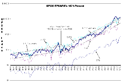
Next I turned to Prof. Shiller’s analysis of the Inflation Adjusted SP500 Index and again compared his chart (Chart 3)analysis vs. the proper semi-log format unadjusted SP500 Index(Chart 4). Prof. Shiller draws conclusions and makes forecasts based on the SP500 Inflation Adjusted chart below. He assumes that uniform conditions applied throughout the period. This is shown to be a very simplistic and incorrect assumption by observation of my semi-log non-inflation adjusted plot of the SP500 below. Pre-1933 and post-1933 environments are readily observed. Again one cannot combine the pre-1933 period with the post-1933 period as he has and make any intelligible analysis much less a valid forecast.
Note that the SP500 grew ~400% faster post-1933 when compared to the pre-1933 pace.
The greatest difference in both instances of Shiller’s analyses is that the laws enacted in 1933 to protect the US financial system, greatly reduced the rate of bank failure post-1933 and the subsequent capital destruction. Prof. Shiller has failed to recognize this in his assumptions that conditions remained uniform throughout the period of his analyses. He needs to reassess his approach.
Chart 3: Shiller’s Inflation Adjusted SP500 Index
Chart 4: “Davidson’s SP500 Index unadj. From Shiller’s Data in semi-log format.
I believe Prof. Shiller’s work by this simple analysis is revealed to be considerably flawed.
Humbly submitted,
“Davidson”
Disclosure (“none” means no position):
Visit the ValuePlays Bookstore for Great Investing Books

4 replies on “Is Case-Shiller Flawed??”
You seem to be using either SP500 as unadjusted or some other method of adjustment than that used by Shiller. Will you explain?
“His chart is inflation adjusted Housing Prices in arithmetic format. My chart below is of his Nominal Housing Price Index in semi-log format.”
Davidson’s data is plotted as unadjusted, as stated at the top of his chart. This does make the apples to apples comparison difficult. It would be interesting to plot CPI along with the other factors to determine if inflation combined with the post 1933 business cycles really contributed to the change in slope.
I will look into it..