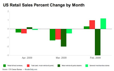
All the talk today is, “are we in recovery or not”. Let’s look at a chart of retail sales which dictates the health of the consumer who is 2/3 of the economy (click to enlarge):
What does it tell us? Things are worse than February but not a bad as March. We could say that the “rate of decline” has slowed so that is good news. We could also say we are “still declining” so that is bad.
What do I think? March was abnormally bad, making April better than it really was. I think we in the middle of the two which means still a sizable decline. This makes sense to me when you seen the recent foreclosure wave, continued record declines in home prices, rising unemployment and steep declines in GDP.
Here is another issue not talked about. 342,000 homes received foreclosure notices last month, on top of the 320,000 the month before. Here is the “issue”. These folks have been mostly being held out of foreclosure because of a 6 month foreclosure moratorium by the banks. During that time frame they clearly were not paying their loan. So, where was the money going? My guess would be clothing, dinners, entertainment, etc. There was no rent or mortgage to pay so it was spent. We know that once people admit foreclosure, they sit and wait without making payments until forced to leave. Unless they are one of the unfortunate to have lost a job (the minority), they now have disposable income that they were before putting towards a home payment.
Now that these folks are getting foreclosed on and booted from their homes, they’ll need to come up with a rent payment. That means far less disposable income available for other uses. The argument can be made this money has be artificially making retail sales better than they would ordinarily have been, and that is a scary thought. It also means we can expect another negative headwind for sales trends to continue down on top of the others previously mentioned.
The point in the exercise is two-fold. First, don’t make long term predictions based on small time data samples. You need a longer series. Second, and more importantly, you need to look at different data, not just one. For instance, if we only looked at the chart above, the clear conclusion might be things are improving. But, if we add the data from home prices, foreclosures and unemployment we get a very different story and then we would have to wonder where the money for people to improve retail sales is coming from.
Disclosure (“none” means no position):